Basic Design Principles
28 Nov
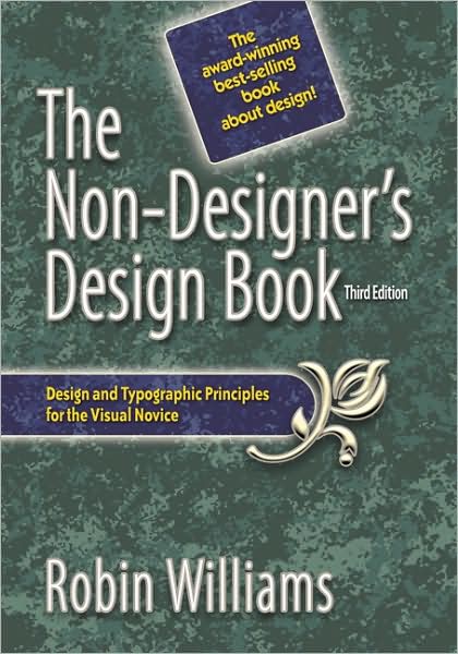
 The four basic design principles:
Contrast
I two items are not exactly the same, then make them different. Really different.
Our eyes like contrast.
Creating contrast is just fun.
Add contrast through your typeface choices, line thicknesses, colors, shapes, sizes, space, etc.
Don’t be a wimp.
Repetition
Repeat some aspect of the design throughout the entire page.
Being consistent.
Create repetition to enhance the design and the clarity of the information.
Be conscious of the value of contrast.
Alignment
Nothing should be placed on the page arbitrarily. Every item should have a visual connection with something else on the page.
Avoid using more than one text alignment on the page.
Center is weak.
Proximity
Organize.
Group related items together.
Avoid too many separate elements on a page.
Typefaces
Make contrast with type, size, weight, form, structure, direction, and color.
Contrast heavy weights with light weights, not medium weights.
Warm colors come forward; cool colors recede. Experiment with the colors of black text.
Think more in terms of horizontal type versus tall, narrow columns of type, rather than type on a slant.
Caps versus lowercase is a contrast of form, as well as roman versus italic or script. Scripts and italics have similar forms-don’t combine them.
Don’t use all caps.
Never put two typefaces from the same category on the same page.
Never put two sans serif typefaces on the same page.
Combining sans serif with serif is a time-tested combination.
Name the problem, then you can create the solution. Find similarities-not the differences.

No comments yet